Blog Layout
Table Widget
Jul 01, 2019
A GREAT WAY TO DISPLAY INFORMATION
The new table widget
is a great new tool for displaying information on your sites. Show contact info, ingredients, branch locations, program events and more in a manner that’s attractive, easy to understand and eye-catching.
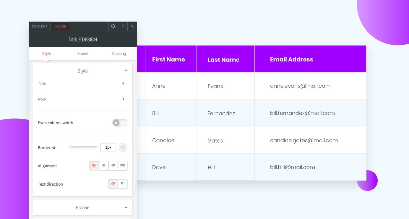
The table widget is easy to set up and design, so your clients can display information effectively. Add the widget to your site and then add content manually or via CSV and customize the font style and colors for the header, even rows and odd rows.
This widget looks fantastic on mobile, and comes with three mobile layouts:
- Scroll is excellent for large tables with several columns and rows.
- Squish is great for tables with just 2 or 3 columns.
- Collapse is good for tables with relatively few rows.

Some great table widget examples
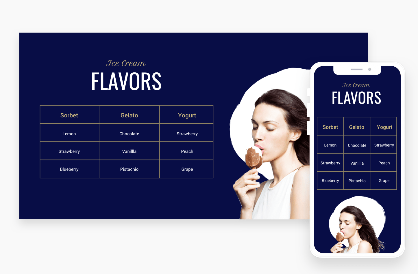
Menu Items
How to build this table in your site
- Add a row with 2 columns and set the row background color to blue.
- In the right column, add an image widget. Choose an image with a transparent background (PNG).
- In the left column, add 3 widgets: text, title and table. Add your content to the table.
- Set the header and row background color to transparent. Set the header font color to beige
- Set the even and odd row backgrounds to transparent and the font color to white.
- Set even column widget, the border to beige, and the alignment to center.
- For mobile, set the layout to Squish.
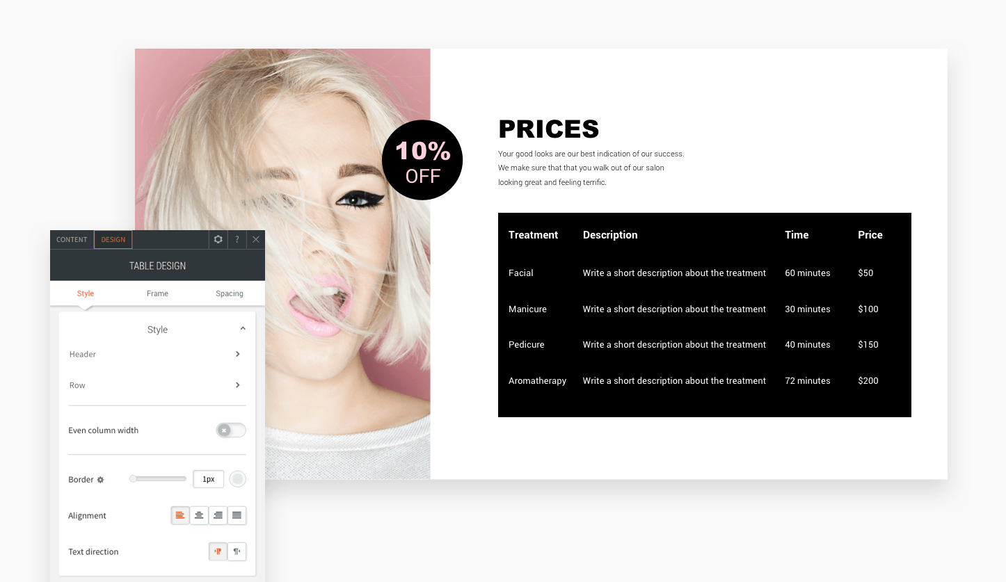
Product Descriptions
How to build this table in your site
- Add a row with 2 columns.
- In the left column, add a background image and set the position to cover.
- In the right column, add 4 widgets: shape, title, text and table. Add your content to the table.
- Set the header and row background color to black.
- Set the header and row color to white.
- Remove the border (set it to 0px) and set the alignment to left.
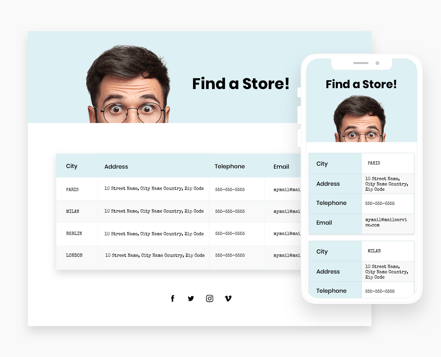
Contact Details
How to build this table in your site
- Add 2 rows. In the first row, add a background image and title widget.
- In the second row, add a table widget. Add your content to the table.
- Set the background color of the header to light blue and set the text to bold and black.
- Set the even row background color to white and the odd row background color to gray. Set the text to black.
- Set the border to gray and the alignment to left. Turn on the frame shadow.
- For mobile, set the layout to Collapse.
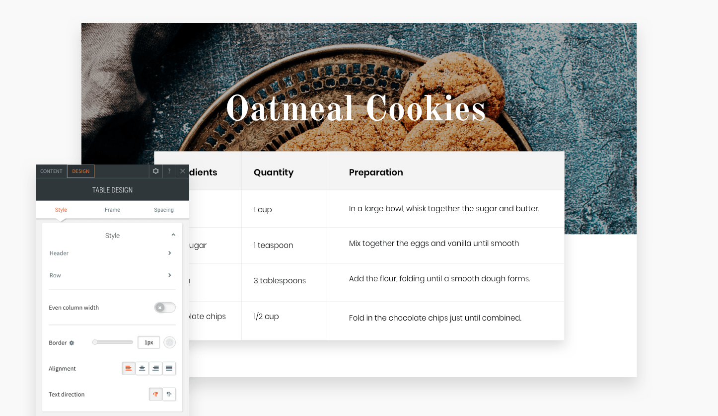
Ingredients
How to build this table in your site
- Add 2 rows. In the first row, add a background image and title widget.
- In the second row, add a table widget. Add your content to the table.
- Set the background color of the header to gray and set the text to bold and black.
- Set the row background color to white and the text to black.
- Set the border to gray and the alignment to left.
- Turn on the frame shadow and set the top margin to -65px.
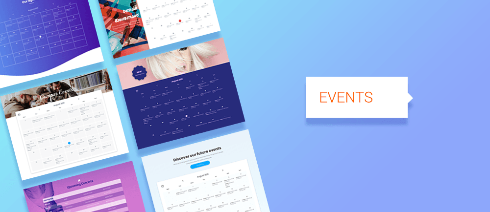
Let your site visitors know what's going on at a glance with 9 eye-catching and informative new Events Sections, built using the Table, Calendar and Gallery widgets. Scroll down to see previews or go to the editor and find them in the new Events tab of your Sections panel.

Inline Binding is the newest way to save time and improve accuracy with Connected Data. In addition to connecting entire widgets to data in the Content Library, you can now connect portions of text (a company name or description, for example) within a larger section of text that isn’t connected. This gives more design flexibility for the data you’ve connected as it can be styled along with the unconnected text.

You can now round corners on columns and inner row. This subtle design capability can have a huge impact on the look and feel of your sites, making sites more visually appealing, softer, and easier to read.